10.9.24

 Errand Into The Maze


July 22 - September 23, 2016

Art House Gallery

Esperanza Cortes
Sky Kim
Paula Overbay
Gilda Pervin


Every seven years, the Athenians had to send seven young men and seven young women to Crete as a sacrifice for their having killed King Minos’ son Androgeus. Without the ritual, the Athenians would have suffered even greater strife in payment for Androgeus’ death. These youths were never heard of again. They were sacrificed to the Minotaur in the labyrinth at Crete. In the traditional myth of the Minotaur, Theseus was the hero who volunteered to free the Athenians from their fate. With the aid of Ariadne, who fell in love with him, Theseus was able to use a ball of twine she provided to navigate his way out of the labyrinth once he had successfully slain the Minotaur. 
 
In Martha Graham’s dance, Errand into the Maze, Graham moves the focus of the story of the Minotaur away from the hero Theseus and onto Ariadne. Ariadne, was a daughter of King Minos and also the Mistress of the Labyrinth. In her role as Mistress of the Labyrinth, she would dance the maze of the Minotaur. It is here in this Minoan myth that Martha Graham’s interest lies. Graham envisions Ariadne’s encounter with the Minotaur in the darkness of the labyrinth as the awakening of her sexuality and her journey into womanhood. The bull as Minotaur is a lunar symbol (because the curve of his horns resemble the crescent moon) and a symbol of male lust. This is where our exhibition Errand into the Maze takes its theme, from Ariadne’s awakening and the exploration of the unknown. The original 1947 program from the first performance of Graham’s work notes, “The action has its core in that errand-journey into the maze of the heart in order to face and do battle with the Creature of Fear. There is the accomplishment of the errand, the instant of triumph, the emergence from the dark.” The four artists of our exhibition each have created work that speaks to the theme of Ariadne and her experience in the labyrinth. 
 
Esperanza Cortés, with her pieces “Las Desaparecidas”, recalls the disappeared of the world who have lost their lives to the despotic. They symbolize the women lost to the maze and the dangers therein. In the context of the exhibition, they become symbols of Ariadne and her journey to enlightenment; through disappointment and loss to wholeness and strength. “Ojo – Debe Costar Un Ojo De La Cara”, created as an emotional reaction to the destruction of present world terrorism also serves as a nod to the destruction of life ordered by King Minos in the legend of the Minotaur; a disquieting reminder that acts of terrorism are not limited to our own turbulent times. These trials have unfortunately been part of the human story since the beginning of civilization.

Esperanza Cortes
Ojo - Debe Costar Un Ojo De La Cara
2010-2015
150 eye portraits, watercolor on paper, 6' diameter, size variable

 
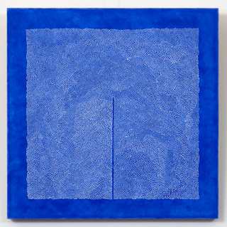
Sky Kim’s labor intensive watercolors have the physical presence of the labyrinth. Through their leafy textures and forms, they recall the diversions of the garden mazes of the Renaissance. The negative spaces in each of the paintings, also engender notions of sexuality, recalling Ariadne’s personal journey.


Sky Kim
Untitled
Watercolor on paper
40 x 40 inches

 
Paula Overbay’s paintings, not only have the visual reminders of the maze, but they imbue the concept of the thread provided by Ariadne to Theseus as his means of return through the complicated passages of the labyrinth. Overbay used as her point of reference the legend of Penelope, who put off her suitors while waiting for Odysseus’ return by weaving a tapestry. Upon the completion of her work, she was to make her choice. But, what she wove during the day, she undid at night and thus staved off a remarriage until her husband’s return. So here the symbol of thread and weaving become intertwined with the maze.


Paula Overbay
Bee Line II
2011
acrylic on wood
16 x 16 inches


Gilda Pervin uses both the sexual imagery of Ariadne’s dance and the crossing pathways of the maze in her works. “Monologues” reminds us, through is expanse and variety, that every woman has her story to tell and each is important and individual. In her assemblages of twigs and other objects, she provides the complicated form of the twisting maze where we can lose our way as we take the wrong direction, when the surety of emerging into the light can turn sinister.


Gilda Pervin
Waiting For Dawn
burlap, acrylic paint, chinese chestnut, found objects
6 x 8.5 x 2.5 inches


The maze is not a straightforward symbol of the journey, either of darkness or of spiritual or sexual awakening. Whether we are encountering our personal monsters or seeking the New Jerusalem, the maze is more complicated by the fears that haunt us, or the tools we need for combat. It is an experience that we must live through and emerge transcendent from, if we emerge at all. As Ariadne knew, for each of us who traverse the dark halls to regain the light, there are those who are trapped in the dead ends.  
 
Arthur Bruso • Raymond E. Mingst 
Curators


29.8.23


The overlapping circles start out as golds on the edge and melt into oranges, reds, blues, greens, and then back to golds for the middle of the quilt. A bit of her daddy’s Sunday shirt is matched with Abigail’s lace slip, the collar from Hope’s graduation dress, the palm of Grace’s baptismal gloves. Trunks and boxes from the other place gave up enough for twenty quilts: corduroy from her uncles, broadcloth from her great-uncles. Her needle fastens the satin trim of Peace’s receiving blanket to Cocoa’s baby jumper to a pocket from her own gardening apron. Golds into oranges into reds into blues… She concentrates on the tiny stitches as the clock ticks away. The front of Mother’s gingham shirtwaist — it would go right nice into the curve between these two little patches of apricot toweling, but Abigail would have a fit. Maybe she won’t remember. And maybe the sun won’t come up tomorrow, either. I’ll just use a sliver, no longer than the joint of my thumb. Put a little piece of her in here somewhere.

Gloria Naylor, Mama Day (New York: Ticknor & Fields, 1988)


More Than Perfect

We’ve become accustomed to perfection; we expect it. Particularly in the manufactured goods we buy. Despite the occasional random note slipped into a new pair of trousers announcing that that particular garment was inspected by ‘Ann’ (or an anonymous number) we have no interest in whose hands assembled the object we bought. Instead, we’d prefer to assume that no human hands touched the item at all, that everything were made by machines.

Machines work tirelessly and predictably. What they’re programmed to do will be done and the first will look like the last. As consumers, we take this for granted in all commodities. We’re trained to look for flaws and reject any defect. Bad seams, uneven color, a nick or a dent— it goes back to the store for replacement or a refund. We’ve even extended this mania for perfection to our food. We will not buy spotted apples or oranges that aren’t brightly consistent. This makes the work of an artist especially difficult. Increasingly, the artist is expected to compete with the slick results of machine manufacturing. 

An impeccable line is favored above the idiosyncratic hand of the maker. The variance that occurs from hand applying a color is considered a clumsy mistake. We want what an artist does to look like a product. In some contemporary art practices, this is exactly what is done. The object is created in a way that emulates manufacturing methods and reduces the evidence of the individual in order that the object can be more saleable.

The exhibition 3: Patricia Dahlman, Robyn Ellenbogen, Julie McHargue, goes against the current towards glistening, corporatized fabrication. It is not only an appreciation for the handmade in art, but a paean to craftsmanship. Patricia Dahlman uses sewing as another way to draw. “I sew marks with thread that one might make using pencil or paint. I like the surface, light and the feel of an embroidery that you get in a sewn drawing.” Her large hanging fabric sculpture, “Figure in Red,” harkens to a three-dimensional Stuart Davis painting. The colored shapes are ostensibly figurative, but it is the relationships of the colored shapes as they move in space that is the true idea of the piece. In talking about her use of materials Dahlman says, “I want to get to the idea rather than deal with a more complicated working process such as welding or making ceramics.”


Robyn Ellenbogen’s “Particular and Absolute” is as much an environment as a sculpture. Its cloud of multi-colored circle modules of sewn paper, hanging in the air, forms a dense, kinetic energy. Like the color interactions of Hans Hofmann, their presence changes the energy of the space and our perception of the environment. For Ellenbogen, “the sewn paper constructions evolved as a means of experimenting with the light.” Family tradition also inspired her interest in sewing as a medium. “My mom was a stellar seamstress and her interest in sewing dresses introduced me to a rich world of textiles and tactile sensation.”


Julie McHargue learned Appalachian traditions of sewing and quilting from her grandmother. “I would spend weekends with [her] as a child. She would show me how to make patterns, sew doll clothes and piece together quilt patterns from tiny scraps of fabric. Her house was small and simple in a rural community of around 500 people. She came from the hills of Kentucky and raised 12 children. She taught me…the depression era mind-set of using everything and wasting nothing. When I sew I feel her and my heritage.” McHargue’s series of six fabric panels wed Folk Art tradition with the compositional and color brevity of Kazimir Malevich. Each panel stands alone as an elegant work, but as a series it is possible to trace the progress of the theme as it expands and contracts from one panel to the next. This
creates an active, living work.


Dahlman, Ellenbogen and McHargue create potent works that celebrate the artist’s hand and stretch our ideas of what can be achieved through sewing and the sewn line. While their work transcends the domestic realm, we also attest that it honors the significance of the traditions from which they draw. Sewing, quilting, crochet are enmeshed in our histories and women have most often safeguarded this heritage. Through their art practices, Dahlman, Ellenbogen and McHargue assert the value of the craft in their work and point a way to the future of these traditions as expressed through contemporary art.

curators

8.12.22


 VANISHING POINT

February 18 — April 15, 2016


TO AUTUMN.

1.

Season of mists and mellow fruitfulness,

Close bosom-friend of the maturing sun;

Conspiring with him how to load and bless

With fruit the vines that round the thatch-eves run;

To bend with apples the moss’d cottage-trees,

And fill all fruit with ripeness to the core;


To swell the gourd, and plump the hazel shells

With a sweet kernel; to set budding more,

And still more, later flowers for the bees,

Until they think warm days will never cease,

For summer has o’er

-brimm’d their clammy cells.


2.

Who hath not seen thee oft amid thy store?

Sometimes whoever seeks abroad may find

Thee sitting careless on a granary floor,

Thy hair soft-lifted by the winnowing wind;

Or on a half-reap’d furrow sound asleep,

Drowsed with the fume of poppies, while thy hook

Spares the next swath and all its twined flowers:

And sometimes like a gleaner thou dost keep

Steady thy laden head across a brook;

Or by a cider-press, with patient look,

Thou watchest the last oozings, hours by hours.


3.

Where are the songs of Spring? Ay, where are they?

Think not of them, thou hast thy music too,—

While barred clouds bloom the soft-dying day,

And touch the stubble-plains with rosy hue;

Then in a wailful choir the small gnats mourn

Among the river sallows, borne aloft

Or sinking as the light wind lives or dies;

And full-grown lambs loud bleat from hilly bourn;

Hedge-crickets sing; and now with treble soft

The redbreast whistles from a garden-croft,

And gathering swallows twitter in the skies.


John Keats

1795 - 1821


GODS AND MONSTERS FROLICKING UNDER THE TREES in their bountiful Edens; the utopian landscape has been a subject of art since the ancient Greeks. In Western art, the landscape has occupied the greater or lesser part of the background of a depiction, yet the focus was always on the figure (ourselves). By the end of the 15th century, through the work of Giorgione and Titian, landscape was increasingly integrated into painting. Still, it remained the setting for human or supernatural activity. It was the Dutch who did away with the human presence in landscape art and made it the sole subject of a painting. As styles of landscapes evolved they were elevated from the lower position in the hierarchy of genres (just above that of animal and still life painting) to that of high art by the inclusion of historical, classical or religious subjects. Painting that was the product of the artist’s imagination commanded the greatest attention from the public and the academies. For example, Claude Lorrain (1600-1682) would ennoble his landscapes with the fanciful addition of historical or mythological figures to serve the expectations of high art.


The 19th century saw the concept of the pure landscape take hold fully. In Europe, the Romantic school found inspiration in wildness and with atmospheric effects. The Hudson River School following the European Romantics, tried to depict the hugeness and grandeur of the new America as the country began expanding its political power. Then the Impressionists pulled it back in and began looking at how fleeting light affected the moment. From Impressionism onward, art and the landscape became evermore conceptual.


ABOVE: In 1859,The Heart of the Andes by Frederic Edwin Church (1826-1900) captivated audiences when it was exhibited for the first time in New York City. Over 12,000 people paid twenty-five cents each to view the five feet high, almost ten feet wide painting that established Church as the preeminent landscape painter in the US.


With Vanishing Point, Art House Gallery is looking at the ways contemporary artists are portraying the landscape now. The natural environment has lost none of its draw to artists, but unlike in past eras, there is no dominant school to dictate the approach an artist should take.


Gillian Wainwright brings us back to the 19th century with her referencing of Impressionism in “Orange Streak”. The dominance of the brush stroke and the reliance on color and light retain the immediacy of the fleeting moment. Michael Ensminger also gives us an impression of the landscape, but with a more conceptual view. His “Early Morning Drift” is both a comment on environmentalism through the reuse of a paper bag as the support of the work, while the texture and form of the embroidery references drifting snow as it falls and accumulates.


Casey Inch with “Ravine” and M. Benjamin Herndon with “Untitled” are both commenting on overpopulation and urban sprawl as they contribute to the disappearance of wilderness. Inch, by whitening out the landscape painting, declares that the 19th century Romantic ideal of the grand wilderness of the expanding country has reached a crisis of depletion and encroachment. As we strive to reuse and recycle, still we continue to expand and overpopulate. Herndon sees his print as a meditation on harmonizing these dichotomies of human existence in nature.


Michael Dal Cerro’s, “The Provisional City” and Sarah Nicole Phillips’, “Office Solution” both make comments on the urbanization of the landscape. Dal Cerro sees the man-made environment as an Escherian maze of towers and tunnels that threatens to consume the globe until the only way left is up, while Phillips envisions the time when our sterile, cubicle dominated workspaces revert back to the wilderness we are only just holding back.


Sara Sutro and Elin Noble both take a more Zen, abstract approach to nature. Sutro’s “Landscape Composite” celebrates the changing color of the land/sky horizon at dawn or dusk. Noble’s work in silk, “Danube 3”, is a meditation on the fluidity and movement of water.


Both Anthony Santella and Robert Lach have narrowed their focus away from the expansive view of nature and concentrated on the microcosm. Lach takes his forms from an insect’s architectural design, and also incorporates materials from the landscape with “Nest Colony II”. Santella has enshrined in his Wardian case a bit of the earth itself creating his own tiny, mobile landscape that seems set to scurry off to find new ground.


Amber Heaton sets her sights on our place in the universe with her works “All the Sunlight” and “All the Moonlight”, where she tracks the changes in the placement of the sun and moon from her spot in Brooklyn. These drawings map our place as the earth travels through space with its constant companions, the life-giving sun and the tide-making moon.


We only have one earth, and we may be alone with our life in the universe. Vanishing Point is part of that constant awareness that we must cherish the uniqueness of that life and the natural beauty that surrounds us on our planet. There is no other.


Arthur Bruso & Raymond E. Mingst

curators


THE ARTISTS: 


Nicole Antebi, Lasse Antonsen, Nancy Cohen, Ian Costello, Michael Dal Cerro, Michael Ensminger, Amber Heaton, M. Benjamin Herndon, Casey Inch, Tom Koken, Ellen Kozak, Sahar Kubba

Robert Lach, Dominic Montuori, Elin Noble, Gilda Pervin, Sarah Nicole Phillips, Anthony Santella, Robin SherinSarah Sutro, Gillian WainwrightDebra Weisberg


Vanishing Point was presented through Art House Productions.

8.4.22

 After Image

Contemporary Artists & Photography


However the image enters
its force remains within
my eyes
rockstrewn caves where dragonfish
evolve
wild for life, relentless and acquisitive
learning to survive
where there is no food
my eyes are always hungry
and remembering
however the image enters
its force remains...
Audre Lorde,
Afterimages, (1981)

April 4 - May 29, 2015

The first photographers were inventors, scientists or those mechanically inclined—the grinding of lenses and the chemical processes were often of more interest to them than the artfulness of the images created. Artful or not, it was immediately apparent how extraordinarily effective photography was at depicting with accuracy the world in front of the camera. Artists became captivated by the new technology. They could easily record a portrait, a view, or a moment in time and revisit it as reference material for their work. Edgar Degas was among the 19th century painters who embraced photography. It’s possible to infer the influence of the technology on his painting from the cropped figures and framing of his subjects.
Edgar Degas, A Ballet Seen from the Opera Box, c. 1884,
pastel on paper, 25.75 x 19.875 inches.

Ever since Nicéphore Niépce, Hércules Florence and Henry Fox Talbot developed fixable photography in the 19th century, there has been debate whether the medium could evolve beyond its use as a documentary tool. The Pictorialism movement of the late 1800s to early 1900s aimed to bring respect to photography as an art form. Pictorialist works would often be soft focus, toned images with the surfaces enhanced to mimic qualities of drawing or engraving. Edward Steichen was a Pictorialist who had trained as a painter. Along with Alfred Stieglitz he opened the Little Galleries of the Photo-Secession. The gallery and Stieglitz’ magazine Camera Work actively promoted photography as a fine art. 

As a young man, Paul Strand visited Stieglitz’ gallery and was inspired by the Pictorialists. Strand later introduced greater abstraction into his compositions and has been credited with bringing Modernism into photography in the 20th century. Alfred Stieglitz followed soon after with his “Equivalents” series, which he insisted were equivalent to the abstract paintings of Wassily Kandinsky. By the 1960s, Vito Acconci was using photography as a means to convey his conceptual ideas of time and space, while Robert Rauschenberg was blanketing his work with photo transfers devising a photomechanical texture the content of which had little to do with the meaning of the work itself. 

Artists have actively engaged with photography in innovative ways since its invention, but it wasn’t until the 1970s that Sam Wagstaff, mentor to Robert Mapplethorpe, changed how it was perceived and valued as art. Wagstaff recognized that photography was undervalued.He began to collect American, British and French photography from the 19th century and eventually amassed an extraordinary collection. He is credited with establishing the modern market for collecting fine art photography. Previously, photography careers had been almost exclusively tied to the media—journalism and advertising. The collecting world had finally caught
up to Pictorialist assertions.

It was the Postmodern 1980s that saw an increased number of visual artists trained as painters fully embracing photography as a medium. Cindy Sherman staged her photographs and challenged the primacy of documentary, fashion and other types of photographic conventions. Jan Groover began juxtaposing images that together had more meaning than a single photograph. At the same time, there was a rise in interest in antique processes, inexpensive cameras and the distortions they made, and prints that would have made Ansel Adams weep with despair. 

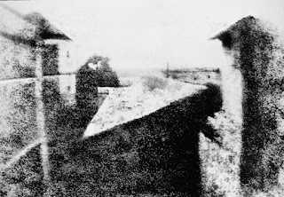
Photography now is more simple and accessible than ever. With our camera phones at the ready we’re all perpetual image makers and sharers. We’ve gone from the alchemical dimness of “View From the Window at Le Gras”— the oldest surviving camera photograph, by Nicéphore Niépse, c. 1826—to the vivid, relentless static of our social media feeds. 

After Image is showcasing visual artists who are celebrating the photographic image, but are using it in ways that expand it as an expressive medium and are forcing it to conform to their idea of what a photograph can be. 

Returning to the beginnings of mechanical reproduction in art, Marsha Goldberg, “Smoke Billows from the Scene of a Blast in Bagdad,” and Joey Parlett, “Manassas,” render it back into a unique work of art through carefully distilling the photographic tones into a drawing. 

Nina Meledandri, “#915-3852,” and Kirsten Nash, “Bouquet Installed with Print Display,” find a conceptual relatedness between photography and painting by juxtaposing painting with the photograph, each informing the other and creating new meaning for both. 

Ross Bennett Lewis, “Missing,” like Sherrie Levine, takes a photograph of photographs. Lewis transforms the portraits of victims of 9/11 into a memento mori, a still life of a tragic moment of loss.
 
Nicéphore Niépce, View from the Window at Le Gras, c. 1826, photograph on pewter
plate, 6.4 x 8 inches. Below is a version enhanced by Helmut Gernsheim, c. 1952.


Bill Westheimer, “Las Vingeles” takes a small edge of a photograph and by enlarging it to extreme proportions, evokes surreal, panoramic landscapes that cause us to question our idea of place. 

Mary Pinto, “Plant,” Brett Wallace, “Organic #1” and Julie McHargue, “AP 1” to “3,” use the photograph for its color and texture to build three-dimensional objects that transforms the static source material into something visually kinetic. 

Julia Rooney, “I did a series in very hot August,” and Dennis Santella, Untitled, from “Electric Dreams,” explore the plethora of images that have inundated our lives with the popularity of the internet and digital photography. Rooney co-opts the low-resolution screenshots from Skype conversations and transforms them into oil sketches, imbuing them with more personality and meaning than was apparent in the small, deadpan digital captures. Santella explores our increasing fascination with technology and images by capturing a bit-mapped still from a digital video transmission and questions the information our culture is currently receiving. 

Emmy Mikelson, “Elevation no. 24,” takes us directly into the future with her non-object image. The idea of the tangible photograph as an object has been replaced by an image that exists only in digital space. No need for permanence at all, except for the saving of an electronic file. 

Each of the artists in After Image are deconstructing the idea of what a photographic image can be, rebuilding it into something new. By inputting their unique talent into these works, we discover that image making has a means of expression as rich and mutable as painting and sculpture. The photograph serves the visual artist as another powerful weapon in their arsenal of expression.

Arthur Bruso
Raymond E. Mingst
Curators


Artists


 This exhibition was our inaugural exhibition as curators of Art House Gallery in Jersey City. 


21.7.21


Obsolescence


OCTOBER 18 — NOVEMBER 30, 2014

This is a 2-location exhibition presented at Curious Matter & Art House Productions Gallery. The galleries are open Sundays noon to 3pm, and by appointment, for the run of the show. Curious Matter, 272 Fifth Street, JC, NJ & Art House Productions Gallery 136 Magnolia Ave., JC, NJ.
.
“Tomorrow, and tomorrow, and tomorrow,
Creeps in this petty pace from day to day
To the last syllable of recorded time….”
Macbeth, William Shakespeare

ART HISTORY as a progressive timeline is obsolete. Yet, try as we might, we can’t seem to shake the belief in a narrative thrust that takes us from the idea of the primitive cave painting, to the sophistication of abstraction, onto the indulgences of post modernism; each age cumulatively adding to the weight of Art, until we find ourselves all but crushed by the heavy accretion of high culture. Is art a relentless progressive development of simple ideas to the increasingly complex, or does each era and culture possess the skills attuned to express their culture in a way that transcends linear progression?


Michael Ensminger, Drift, 2014, Glitter and oil on found ‘paint-by-number’ on panel, 16 X 20 inches

A charging auroch painted on the wall of the cave in Lascaux shows no less dynamism than a haystack by Monet. What does separate them, besides the wide gulf of time, is their intent. We want to believe that the Lascaux painter was painting an auroch in the hope that the image would conjure up the reality (we have no proof that this is so), while Monet was studying the way light changed on an object hour by hour through the day (he was able to tell us this was so). Intent is the fuel of the art world. It keeps the train of ideas chugging along, from chiaroscuro to Baroque, from the Academy to geometric abstraction artists are full of ideas. Art history is littered with fallen ideas and ways of thinking which are intriguing to consider in the context of their time — in some cases still moving and thrilling to experience — nevertheless, in present practice we perceive them as obsolete. What do we do with the artist who tries to resurrect cubism or impressionism today? That again depends on their intent; are they trying to trick Sotheby’s or make a buck at Art Around the Park?
For the latest Curious Matter exhibition, in collaboration with Art House Productions, we have taken the notion of Obsolescence, whether it be ideas, materials or the very concept of objectness, and given it over to the artists to see how yesterday’s news influences our work now.


Guillaume Légaré, Untitled (Ghost no.5), 2014, Cyanotype, framed 11 X 16 inches

Many of the artists exhibiting in Obsolescence found their inspiration through media that has become outmoded because of the rise in digitization of imagery. Michael Ensminger makes a comment on the death of painting with “Drift, 2014.” Using a found paint-by-number, he whites out the central portion, symbolically erasing the entire history of Western Art. Using the antique photographic method of cyanotype, Guillaume Légaré (“Ghost no. 5”) not only informs us that film is dead, but his imagery of the ghost drives the point home.

Robert Gould and Jason Scott Kofke both explore bygone technology in their work. Gould’s collage (“Fallen Zeppelin”) of the skeleton of a zeppelin speaks to the brief history of this ultimately, tragically unsafe method of transportation. Kofke’s “Everything Will Be OK, 1956” takes the concept of how rapidly technology advances by presenting his drawing of a space console, c. 1956, on a turn-of-the-century piano roll, juxtaposing two outmoded technologies, both of which have their nostalgic appeal.


Anne Percoco, Field Studies, 2011, Collage, 42.25 X 20.25 inches

Julie McHargue and Anne Percoco invigorate old items by recycling them into new works. McHargue’s “Vessel 3” uses a coil of zippers to construct a tapering vessel, while Percoco (“Field Studies”) adapts the outmoded yellow pages telephone book into elaborately verdant landscapes from the plant imagery she found within.

Ross Bennett Lewis brings into focus the precarious fate of art itself with his photograph “Eero Saarinen for TWA”. This building has been in the news recently when it was announced that it would be replaced, then repurposed, and now waits in limbo. Long considered a masterpiece of modern architecture, Saarinen’s TWA Terminal has become obsolete as a transportation hub since air travel has grown in popularity and the technology of the building has become superseded by larger and more accommodating development.

Time moves on. We as a people are constantly looking for a new horizon, a better way of doing a task, or fresher coat of paint. We are somehow never satisfied with what we have accomplished. This drive for better and more has brought us miraculous inventions and lifted us out of the trees and into skyscrapers. But how sustainable is our appetite for the new? The artists of Obsolescence present alternatives and opinions, if not answers to that quandary.

Curated by Arthur Bruso and Raymon E. Mingst
CURIOUS MATTER

21.12.20

The Broad and Narrow Way

THE CURIOUS MATTER HOLIDAY INSTALLATION, 2016-2017

BY CHANCE AND APPOINTMENT DURING THE HOLIDAYS

IT HAS BEEN A YEAR OF CHOICES. Our conversations were uncharacteristically colored by references to the politics of the day. Those who might otherwise seem apolitical or divorced from the machinations of red, blue and green ideologies were vocal and passionate this year. Among the candidates for the 58th presidential election the usual histrionics were pitched high. Following the inescapable spectacle of the campaigns, the outcome was a potent shock to many. We’ve noted the lingering despondency of those disappointed in the tallies match the bleak grey that shades our end-of-year daylight hours.

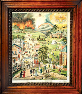
Victorian Lithograph of the religious concept of the Broad and Narrow Way.

Lithograph, The Broad and Narrow Way, 1883


We’ve searched our collection of household devotions and have chosen the print The Broad and Narrow Way to illuminate our thoughts and feelings for this particular year. It serves as the centerpiece of our holiday installation. The image was designed in 1862 by a pious woman from Stuttgart, Germany named Charlotte Reihlen. She envisioned the work and called upon the drafting skills of a young man named Schacher. Together they worked and reworked the various scenes. The final lithograph was based on several of their sketches. The German edition was followed by a Dutch translation and eventually others in English. Our version was printed by Headley Brothers and published by Gawin Kirkham of London in 1883.

The work illustrates Matthew’s gospel:
7:13 Enter by the narrow gate; for wide is the gate and broad is the way that leads to destruction, and there are many who go in by it.
7:14 Because narrow is the gate and difficult is the way which leads to life, and there are few who find it. —The Holy Bible, New King James Version

The print’s “broad way” captures a cacophony of temptations, from a beer garden to a ball room, a tavern of “worldliness,” and even a loan office at the side of a gambling hall. Ultimately, the broad road leads to the orange and yellow tongues of flame that will greet the damned — the sky above populated by lost souls who float in despair among jagged bolts of lightning. This way to destruction meanders up the left side of the picture plane, while the pastoral scenes of the narrow way occupy the right. Church, Sunday school, and other godly activities lead to the kingdom of heaven. Here we find life and salvation, the sky golden with angels.

For each vignette depicted, a passage from the Bible is referenced to reinforce Christian doctrine and illustrate the steps along the road to hell or heaven. For example, on the left, next to a barmaid and a couple of men drinking we read: “Isaiah 5:11” which corresponds to the quote: “Woe to those who rise early in the morning, That they may follow intoxicating drink; Who continue until night, till wine inflames them!” To the right, on the narrow path, “Mark 6:2” is printed on the side of a Sunday School — “And when the Sabbath had come. He began to teach in the synagogue. And many hearing Him were astonished….”

Our installation also includes a hand-painted Victorian lantern slide. The scene on the glass depicts a man in bed suddenly awake from a dream. He clutches his forehead, and swirling above him is a scene of damnation on the left and salvation on the right — a duality that matches the lessons of The Broad and Narrow Way. Our gentleman must make a choice. He is being forced by the powers of the Spirit to confront his life’s goal. Will he follow a path towards damnation or accept the Divine and be allowed the key to heaven and union with God? While Charlotte Reihlen presented us with public scenes to illustrate the choices we face, the lantern slide reveals a more private grappling with which path we’re to take.

Hand-painted Victorian lantern slide depicting a man in bed having a vision of angels.

Hand-painted Victorian lantern slide depicting a man in bed having a vision heaven and hell.

The annual Curious Matter holiday installation, as ever, seeks to uncover the universal message, the good will, the aspect of our most noble efforts as humans to do and be good, as found within our personal connection to household devotional artifacts. This year, The Broad and Narrow Way lithograph is so richly encoded with Biblical reference that it is possible our intention may seem indecipherable to anyone other than a religious scholar or someone as pious as Frau Reihlen herself. But, our intention is simple.

Each of us must make our own decisions and follow the consequences of our own actions. In the end, whether in public or private, the choices are ours. If you look closely at the fence that divides the broad from the narrow way in our print, you’ll see it is broken in several places. Apparently, there are opportunities to slip from one side to the other. So, it would seem no one is irredeemable, or for that matter, beyond the lure of temptation. In a year where we were asked to choose, the year ahead will bring yet more choices. The Broad and Narrow Way, for us, isn’t so much about what any one religion or doctrine may assert as the true path of righteousness. Rather, how do we reach out to those who occupy a place that seems beyond reconciliation with our own? Our own path has been a meandering one. It may not be pious, or hold fast to the narrow way, but it benefits from quiet contemplation. And, when we require fortification to speak out, our hope is that no one’s humanity is denied in the process. The remnants of our Catholic catechism still color our world view; we aspire to extend good will towards all.

As we march into 2017, we wish you all love and happiness and trust our finest collective sentiments will illuminate the path forward.

Every best wish for the world,
Raymond E. Mingst & Arthur Bruso
Curious Matter

Broadside of the article.

Broadside